Okay, I know there are differences between movie posters and book covers, primarily because the mediums are different. However, I think they have more in common than not. Both are intended to garner audience interest off a quick visual. Both have to rely on that one image to convey enough story, theme, and tone to let a reader/watcher know if this is for them. And both have to decide what the balance will be between images and words. Sometimes the actor’s name – or the author’s name – is big enough to sell the book or movie. Sometimes not.
So I was very interested to see this list of 100 best movie posters of all time. It’s a subjective list, obviously. But what drew my attention is the T.C. Candler’s explanations of why a certain poster worked for him. I think there are some great lessons to be learned for

book cover designs.
Lord of War. Nicolas Cage’s expression here is a brilliant capture of his character of Yuri Olov. Contrast the effectiveness of this cover with another one that was released. The second one is fine, but lacks the drama of the first.Some of my favorites.

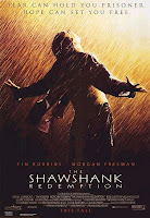
Shawshank Redemption. A little bias here because this happens to be one of favorite movies of all time. But I guarantee this poster would make me see the movie, and if it were a book cover, I’d be in the checkout line with it already.

Rosemary’s Baby. I’m with Candler. Baby carriages in sillouette are just freaky. And how terrific is that creepy green light?
Minority Report. That eye…is watching…me.

Star Wars: Episode 1. Okay, so everyone was going to go see this movie whether there was a poster or not. But while the movie was disappointing, the poster does its job well. Even if I were from another universe and had never heard of Star Wars, I’d want to find out more.

And for fun, if you’re interested, here is someone’s list of the ten worst movie posters of all time.